| Steven Felix Puwandi | ||
| 12241668 | ||
| BGD1105-1 | ||
| Date | Time | Activities |
| 16th July | 01:50pm - 04:00pm | Group discussion |
| 23rd July | 11:00pm - 01:00am | Research |
| 26th July | 12:53pm - 02:11pm | Group discussion |
| 29th July | 11:00am - 12:00pm | Draw icons |
| 31st July | 02:30am - 03:30am | Draw icons |
| 2nd August | 03:55pm - 05:00pm | Group discussion |
| 4th August | 08:00pm - 10pm | Brochure design |
| 6th August | 10:00am - 05:00pm | Revisit zoo |
| 8th August | 04:00pm - 04:30pm | Group discussion |
| 9th August | 12:40pm - 02:00pm | Group discussion |
| 03:00pm - 06:00pm | Group discussion | |
| 10th August | 09:00pm - 10:00pm | Sketching for signages, brochure dsign |
| 11th August | 10:30am - 01:30pm | Group discussion |
| 02:45pm - 07:40pm | Group discussion | |
| 08:45pm - 11:45pm | Group discussion | |
| 14th August | 03:00pm - 06:30pm | Group discussion |
| 18th August | 10:45am - 03:12pm | Group discussion |
| 20th August | 10:45am - 04:00pm | Group meeting |
| 08:00pm - 11:00pm | Brochure design | |
| 25th August | 10:45am - 01:45pm | Group meeting: Digital tracing |
| 02:30pm - 10:00pm | Group meeting: Digital tracing | |
| 27th August | 06:00pm - 08:00pm | Brochure design |
| 28th August | 08:00pm - 06:00am | Blog update, refining digital images |
Wednesday, 29 August 2012
Time Table
| Time Table Lee Tzong Han |
||
| 12234096 | ||
| BGD1105-1 | ||
| Date | Time | Activities |
| 15th July | 9:00pm-11:00pm | Research |
| 16th July | 1:50pm-4:00pm | Group discussion |
| 24th July | 2:00pm-3:00pm | Research |
| 31st July | 11:00pm-1:30am | Research of icon, sketching icons |
| 2nd August | 3:55pm-5:00pm | Group discussion |
| 5th August | 11:00am-3:15pm | Research, Sketching icons |
| 6th August | 10:00am-5:00pm | Revisiting Zoo |
| 8th August | 4:00pm-4:30pm | Group discussion |
| 9th August | 12:40pm-6:00pm | Group discussion |
| 10th August | 9:00pm-10:30pm | Research |
| 4:00am-6:30am | Research, Sketching icons | |
| 11st August | 10:30am-11:45pm | Group discussion |
| 14th August | 3:00pm-5:00pm | Group discussion |
| 16th August | 3:00pm-7:00pm | Digital tracing of icons |
| 18th August | 10:45am-3:15pm | Group discussion |
| 19th August | 3:00pm-5:45pm | Digital tracing of icons |
| 20th August | 10:45am-4:00pm | Group discussion |
| 21st August | 11:00pm-3:30am | Digital tracing of icons |
| 23rd August | 9:00pm-4:00am | Refinement of icons |
| 24th August | 11:00am-3:30m | Refinement of icons |
| 25th August | 10:45am-10:00pm | Group discussion |
| 29th August | 4:00am-8:30am | Slide presentation, critical writing |
Time Table - Angie
| Date | Time | Activities |
|---|---|---|
| 15th July | 11:30pm - 12:30am | Research |
| 16th July | 11:00am - 01:00pm | Research |
| 01:50pm - 04:00pm | Group discussion | |
| 26th July | 12:53pm - 02:11pm | Group discussion |
| 29th July | 04:00pm - 06:00pm | Research, draw icons |
| 2nd August | 03:55pm - 05:00pm | Group discussion |
| 6th August | 07:15am - 08:50am | Thinking about ideas |
| 10:00am - 05:00pm | Revisit zoo | |
| 8th August | 04:00pm - 04:30pm | Group discussion |
| 9th August | 12:40pm - 02:00pm | Group discussion |
| 03:00pm - 06:00pm | Group discussion | |
| 10th August | 10:30pm - 11:15pm | Sketching for signage |
| 11th August | 10:30am - 01:30pm | Group discussion |
| 02:45pm - 07:40pm | Group discussion | |
| 08:45pm - 11:45pm | Group discussion | |
| 14th August | 03:00pm - 06:30pm | Group discussion |
| 18th August | 10:45am - 03:12pm | Group discussion |
| 19th August | 03:30pm - 04:30pm | Digital tracing |
| 11:50pm - 12:40am | Digital tracing | |
| 20th August | 10:45am - 04:00pm | Group meeting |
| 25th August | 10:45am - 01:45pm | Group meeting |
| 02:30pm - 10pm | Group meeting | |
| 28th August | 04:00pm - 07:30pm | Blog update |
| 10:45pm - 06:15am | Blog update, refining digital images |
Tuesday, 28 August 2012
Brochure design
Here are some design development of Zoo Negara Brochure :

by using the icon elements as part of the layout as what angie suggested, then i try to arrange it

but after another discussion and trial, finally this is the final result of the brochure. For the brochure, I decreased some of the information from the previous brochure and keep all the important information only.


Fonts

At first I had chose these fonts for our progression presentation. Other group were assigned to choice which typeface suit our design better. The choices are limited, but they chose the last typeface called Philosopher because it has different sizes of strokes and lines, just like our icons.


Thirteen set of typefaces were found. Since these fonts are free, most of them doesn't have bold and italic. Liwen said that the fonts have bad kerning and other minor but crucial details. Philosopher is a bit too fancy for a way-finding font.

This time, I focused more on simple fonts that are posted on design blogs. I have to pay attention to the details. Signika was chose and used on our signboard.


Gil Sans is our main typeface. It is used on our brochures and signage. Chosen by Steven.
Color reference
Here is some color references that we found during research that is used in wayfinding :


Signage Design
Early sketch for the signage design


After some sketches and discussion with the team mates, here are the final results


How these will look like in actual place :


References for signage :
http://www.behance.net/gallery/Happy-valley-Signage-way-finding-system/1216801
http://www.behance.net/gallery/Hospital-signage/4217139
http://www.behance.net/gallery/signage-barbal/2531781
http://www.behance.net/gallery/CMNH-wayfinding/3131379
http://www.behance.net/gallery/Wayfinding-Design-for-California-High-Speed-Rail/532797
Map Elements and Signage Design
When we started to trace our works, we realize that color for land zone - brown blend in with the surroundings of zoo, so we changed to a slightly similar but different color - orange.

Early color choice of our map
Liwen thought that that shade of blue was too highlighted. Later, I tried different shades of the same colors. In the end, we used the third on top.

At the same time, we are confused by the icon of multipurpose field.

Original icon but transform it into our style

Using canopy, since there's a canopy on the spot. That means that the multipurpose field is for the purpose of event etc. But it looks like circus, especially on map.
There's another problem we need to solve - Buildings. There are a few buildings on the map, but it is not obvious. Since building can be acting as a landmark and visitor might want to visit them as well so we had them included. We don't want the buildings to look like one of our icons cause that will be hard to notice. The third image is the icon for our buildings.


Design we used for our buildings
As for our signboards, we choose to use organic shape with light colored wood texture on. We felt that it is related to nature that way. I had the idea of using Morning Glory-like plants to have them grow upon the pole of directional signage. I know that they might be a problem if they started to cover the instructions but gardeners are employed in Zoo Negara. Later, this idea is dropped.

Early color choice of our map
Liwen thought that that shade of blue was too highlighted. Later, I tried different shades of the same colors. In the end, we used the third on top.

At the same time, we are confused by the icon of multipurpose field.
Original icon but transform it into our style
Using canopy, since there's a canopy on the spot. That means that the multipurpose field is for the purpose of event etc. But it looks like circus, especially on map.
There's another problem we need to solve - Buildings. There are a few buildings on the map, but it is not obvious. Since building can be acting as a landmark and visitor might want to visit them as well so we had them included. We don't want the buildings to look like one of our icons cause that will be hard to notice. The third image is the icon for our buildings.


Design we used for our buildings
As for our signboards, we choose to use organic shape with light colored wood texture on. We felt that it is related to nature that way. I had the idea of using Morning Glory-like plants to have them grow upon the pole of directional signage. I know that they might be a problem if they started to cover the instructions but gardeners are employed in Zoo Negara. Later, this idea is dropped.


Signages
After revisiting Zoo Negara for the second time, we found out that there's actually sets of animal footprints at the beginning of the entrance. Since the footprints have been there, our group thought of keeping the footprints and repaint them into colors of the zones we had previously talk about.

We sketches design for signboards, wondering if we should separate the signboards into zones or just have them all in one sign, whether we should create a signboard that lets visitor chooses or just direct them to a fixed pathway. We chose to let visitors have their own option.

Even though there's signage for bus stop, we discover that the bus doesn't stop at them anymore. So, we decided to not include the signs in our map. For the flags, it will be colors of the zone and that's it. No icons will be printed on it.

Our idea of different flag styles

We sketches design for signboards, wondering if we should separate the signboards into zones or just have them all in one sign, whether we should create a signboard that lets visitor chooses or just direct them to a fixed pathway. We chose to let visitors have their own option.

Even though there's signage for bus stop, we discover that the bus doesn't stop at them anymore. So, we decided to not include the signs in our map. For the flags, it will be colors of the zone and that's it. No icons will be printed on it.
Our idea of different flag styles
Reference for wayfinding.
http://books.google.com.my/books?id=kUzCsra0zskC&pg=PA72&lpg=PA72&dq=why+serif+in+wayfinding&source=bl&ots=5iPUKglG7f&sig=NcSrrr6j0JMejrxoti0-kGqAY5U&hl=en&sa=X&ei=XXkdULj9LYK3rAeQtoCYCQ&redir_esc=y#v=onepage&q=why%20serif%20in%20wayfinding&f=false
This is an e-book which shows the guidance of wayfinding.


Before painting, I have drawn the final version with clearer stroke in grid paper.

However, after tracing all the animal icons digitally, we have realized that those icons look like a drawing, instead of icon. In addition, it cannot be seen from further distance clearly because all the lines are too thin.


About the toilet and restaurant signage, i have tried certain design by using only 1 line. But, it doesn't really work well, and thus separating those character by using 1 line respectively, instead of 1 line for whole icon.

Thinking about the legibility, i have thickened the line and also add circle shapes according to different zones to create a point of emphasis, interest, or dominance. This will capture and hold the viewer’s attention.
Icon of Multipurpose Field & Radius
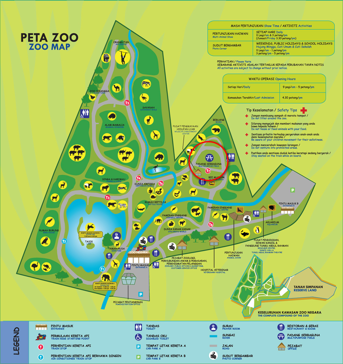
Icon of multipurpose field is very weird. After looking it for some time, we finally found out that the icon is a bench. We wondered if that is an international icon. We Googled for international icon for multipurpose field and field but nothing came up other than graphic icons.
To decide on what to put on signboard place on different places, the idea of using fixed radius and include the ones that is in the radius was used.
Repeated Icons

There are a lot of repeated icons / animals in Zoo Negara's map. In their map, some area display four of the same animals, while the other only show one - Does that mean that that area have four animals and the others only has one? Repeated icons will be removed, leaving only one in everywhere.
Lions and tigers are basically the same species placed in the same area. We wished to make our map simpler so we reduce the other icons and place the icon of one of them instead. For example: The area where the cat family are will be replaced with one animal that is there too, in this case, we have lion on the side it's in and tiger on the other side.
Monday, 27 August 2012


About the facilities icon, our group have been suggested to use the 'one line' idea as well. Nonetheless, the result doesn't show that it is work. Since once inverting them, it shows that the shape and the thickness is too weak to indicate.
Subscribe to:
Comments (Atom)