A journal blog about Steven, Han, and Angie process of development ideas about the way finding assignment
Showing posts with label Group. Show all posts
Tuesday, 28 August 2012
Map Elements and Signage Design
When we started to trace our works, we realize that color for land zone - brown blend in with the surroundings of zoo, so we changed to a slightly similar but different color - orange.

Early color choice of our map
Liwen thought that that shade of blue was too highlighted. Later, I tried different shades of the same colors. In the end, we used the third on top.

At the same time, we are confused by the icon of multipurpose field.

Original icon but transform it into our style

Using canopy, since there's a canopy on the spot. That means that the multipurpose field is for the purpose of event etc. But it looks like circus, especially on map.
There's another problem we need to solve - Buildings. There are a few buildings on the map, but it is not obvious. Since building can be acting as a landmark and visitor might want to visit them as well so we had them included. We don't want the buildings to look like one of our icons cause that will be hard to notice. The third image is the icon for our buildings.


Design we used for our buildings
As for our signboards, we choose to use organic shape with light colored wood texture on. We felt that it is related to nature that way. I had the idea of using Morning Glory-like plants to have them grow upon the pole of directional signage. I know that they might be a problem if they started to cover the instructions but gardeners are employed in Zoo Negara. Later, this idea is dropped.

Early color choice of our map
Liwen thought that that shade of blue was too highlighted. Later, I tried different shades of the same colors. In the end, we used the third on top.

At the same time, we are confused by the icon of multipurpose field.

Original icon but transform it into our style

Using canopy, since there's a canopy on the spot. That means that the multipurpose field is for the purpose of event etc. But it looks like circus, especially on map.
There's another problem we need to solve - Buildings. There are a few buildings on the map, but it is not obvious. Since building can be acting as a landmark and visitor might want to visit them as well so we had them included. We don't want the buildings to look like one of our icons cause that will be hard to notice. The third image is the icon for our buildings.


Design we used for our buildings
As for our signboards, we choose to use organic shape with light colored wood texture on. We felt that it is related to nature that way. I had the idea of using Morning Glory-like plants to have them grow upon the pole of directional signage. I know that they might be a problem if they started to cover the instructions but gardeners are employed in Zoo Negara. Later, this idea is dropped.
Signages
After revisiting Zoo Negara for the second time, we found out that there's actually sets of animal footprints at the beginning of the entrance. Since the footprints have been there, our group thought of keeping the footprints and repaint them into colors of the zones we had previously talk about.

We sketches design for signboards, wondering if we should separate the signboards into zones or just have them all in one sign, whether we should create a signboard that lets visitor chooses or just direct them to a fixed pathway. We chose to let visitors have their own option.

Even though there's signage for bus stop, we discover that the bus doesn't stop at them anymore. So, we decided to not include the signs in our map. For the flags, it will be colors of the zone and that's it. No icons will be printed on it.

Our idea of different flag styles

We sketches design for signboards, wondering if we should separate the signboards into zones or just have them all in one sign, whether we should create a signboard that lets visitor chooses or just direct them to a fixed pathway. We chose to let visitors have their own option.

Even though there's signage for bus stop, we discover that the bus doesn't stop at them anymore. So, we decided to not include the signs in our map. For the flags, it will be colors of the zone and that's it. No icons will be printed on it.

Our idea of different flag styles
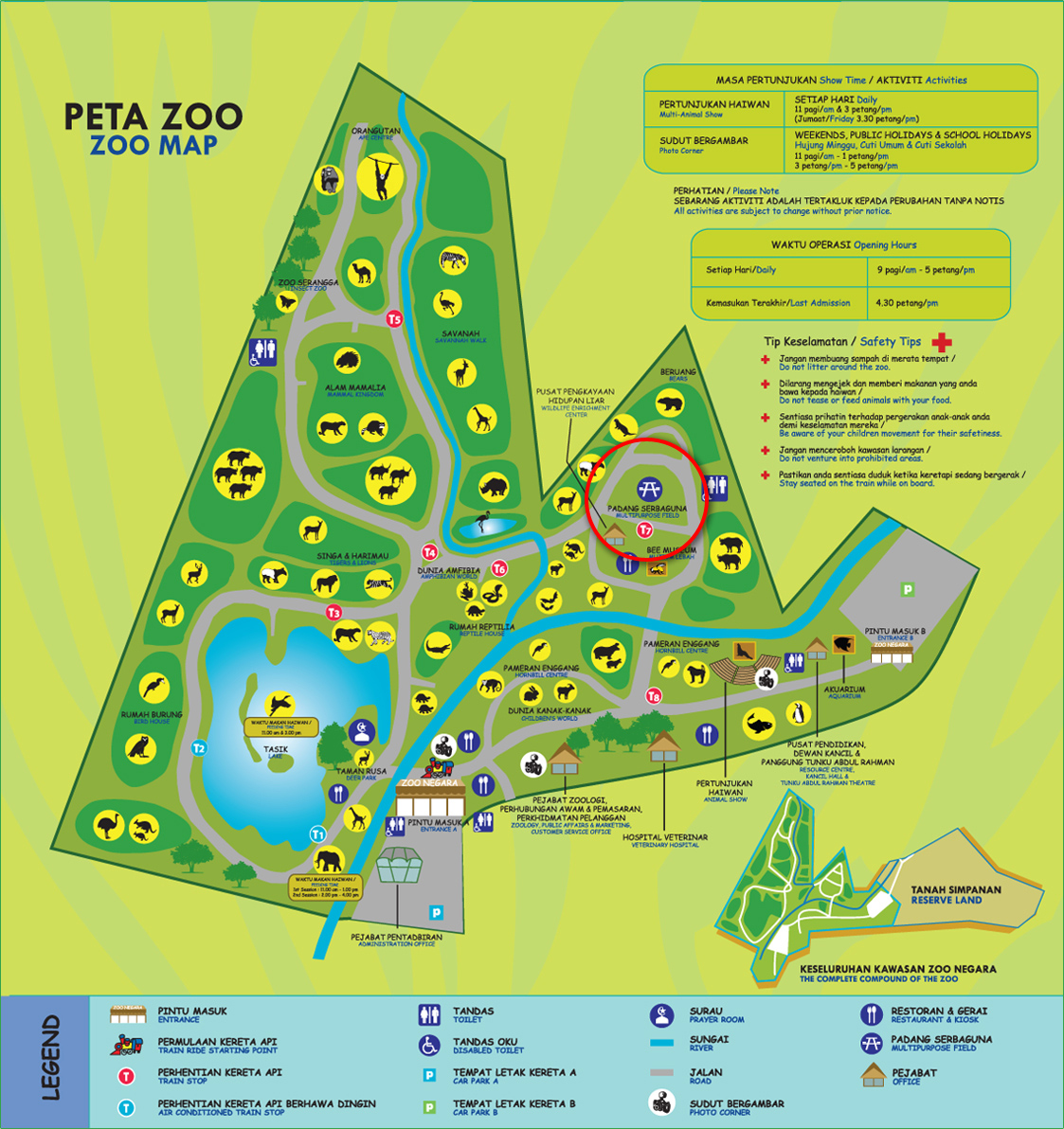
Icon of Multipurpose Field & Radius

Icon of multipurpose field is very weird. After looking it for some time, we finally found out that the icon is a bench. We wondered if that is an international icon. We Googled for international icon for multipurpose field and field but nothing came up other than graphic icons.
To decide on what to put on signboard place on different places, the idea of using fixed radius and include the ones that is in the radius was used.
Repeated Icons

There are a lot of repeated icons / animals in Zoo Negara's map. In their map, some area display four of the same animals, while the other only show one - Does that mean that that area have four animals and the others only has one? Repeated icons will be removed, leaving only one in everywhere.
Lions and tigers are basically the same species placed in the same area. We wished to make our map simpler so we reduce the other icons and place the icon of one of them instead. For example: The area where the cat family are will be replaced with one animal that is there too, in this case, we have lion on the side it's in and tiger on the other side.
Sunday, 26 August 2012
Choosing Icons and Seperating the Zoo into Different Zones
After showing each other our sketches, we choose to use Han's design. Personally, I like the one-line design with it's flow. The one-line design was suggested by our lecturer. Design of our map will be using lines as well. Images shown below are inspiration of our map design.

Virginia Zoo by Nathan Workman

Riga Zoo designed by Maija Gadzāne
We discussed about separating the zoo into different zones. Sadly, zoo did not place the animals according to their characteristic. There's lake and hill on different part of the zoo, hence we separate the zoo into three zones. They are name after their respective landmark. But the other zone that is fill with restaurant, multipurpose field, animal show aquarium etc. It's more like a "facility zone" but this title doesn't fall into the same category with the other two. Then, we came out with "land zone". The zone's color will go with their name - Lake, hill and land, making it blue, green and brown in color. Before this Han suggested to use colors of Malaysia's flag.

Toronto Zoo Redesigned by Ali Niaz
We need landmarks to lead visitors. Getting our idea from the design above, we decide to use flags as landmark, other than what the zoo already has to offer.
We thought about adding trails to our map since there's transportation (small bus) service available in zoo.

Virginia Zoo by Nathan Workman

Riga Zoo designed by Maija Gadzāne
We discussed about separating the zoo into different zones. Sadly, zoo did not place the animals according to their characteristic. There's lake and hill on different part of the zoo, hence we separate the zoo into three zones. They are name after their respective landmark. But the other zone that is fill with restaurant, multipurpose field, animal show aquarium etc. It's more like a "facility zone" but this title doesn't fall into the same category with the other two. Then, we came out with "land zone". The zone's color will go with their name - Lake, hill and land, making it blue, green and brown in color. Before this Han suggested to use colors of Malaysia's flag.

Toronto Zoo Redesigned by Ali Niaz
We need landmarks to lead visitors. Getting our idea from the design above, we decide to use flags as landmark, other than what the zoo already has to offer.
We thought about adding trails to our map since there's transportation (small bus) service available in zoo.
Monday, 6 August 2012
Characteristic of Zoo Negara; Strength and Weakness of it's Map
On our second group discussion, we discussed about the characteristic of Zoo Negara and the strength and weakness of it's map.

Map of Zoo Negara
The Characteristic of Zoo Negara
Map / Brochure

Logo of Zoo Negara
The logo of Zoo Negara is a mouse deer. According to Zoo Negara's website, each stoke and color has it's own meaning. As mentioned in previous post, we were inspired by the logo and we wanted to make icons out of strokes like what the logo does, but in different style.
We were assigned to draw icons of buffalo, elephant, tiger, monkey and birds in stroke and present them in the next meeting.

Map of Zoo Negara
The Characteristic of Zoo Negara
- Logo
- Most of the area are open air
- Insect Zoo, Bee Museum, Reptile House, Children's World, Aquarium etc.
Map / Brochure
- Strength
- Detail of information
- Color of nature
- Typeface
- Compact folding / size
- Suitable choice of paper - Waterproof, feels good to hold since it's glossy and smooth
- Weakness
- Weak layout
- Image with low resolution
- Standardization of images and icons
- Some icons are hard to recognize
- Malay word is larger than English - Not convenient for tourist
- Map could be easily torn after folding and reopen constantly.

Logo of Zoo Negara
The logo of Zoo Negara is a mouse deer. According to Zoo Negara's website, each stoke and color has it's own meaning. As mentioned in previous post, we were inspired by the logo and we wanted to make icons out of strokes like what the logo does, but in different style.
We were assigned to draw icons of buffalo, elephant, tiger, monkey and birds in stroke and present them in the next meeting.
Sunday, 5 August 2012
Direction of our Design
For our first group discussion we are trying to decide our style. We discussed about the map. Steven came up with interactive maps such as magnetic map, pop up map and monopoly map. But is it suitable for marketing?

Interactive game-like info graphic (Image taken from Good News)
The shape of Zoo Negara has pointy edges instead of curvy lines. It is quite distracting. The maps we usually see are in organic shapes, hence we wanted to change the shape of Zoo Negara's map curvier.
After that we talked about logo design. We decided to use the original logo from zoo negara while the icons should be inspired by it's strokes and curvy dynamic shape.
We watched a video from YouTube about airport way finding. The video let us know some common knowledge about way finding in airport and it's difficulty.
Steven had an idea of using animal's footprint as a guide in zoo to different animals and I had found a the same idea being used. The idea might be used often. In addition, not every animal have their footprint standardized.

Footprints concept by Danielle Quast Tostes - Nayelianne

Interactive game-like info graphic (Image taken from Good News)
The shape of Zoo Negara has pointy edges instead of curvy lines. It is quite distracting. The maps we usually see are in organic shapes, hence we wanted to change the shape of Zoo Negara's map curvier.
After that we talked about logo design. We decided to use the original logo from zoo negara while the icons should be inspired by it's strokes and curvy dynamic shape.
We watched a video from YouTube about airport way finding. The video let us know some common knowledge about way finding in airport and it's difficulty.
Steven had an idea of using animal's footprint as a guide in zoo to different animals and I had found a the same idea being used. The idea might be used often. In addition, not every animal have their footprint standardized.
Footprints concept by Danielle Quast Tostes - Nayelianne
Subscribe to:
Posts (Atom)